How to choose the perfect colours for the baby's room?
Nateo CONCEPT
Nursery: the perfect colors
Choosing the right colors for the nursery is essential for your baby's well-being. Discover our tips for creating a soothing and harmonious space from their earliest months.
Creating a peaceful space: Color choices to promote calm
The importance of soothing colors
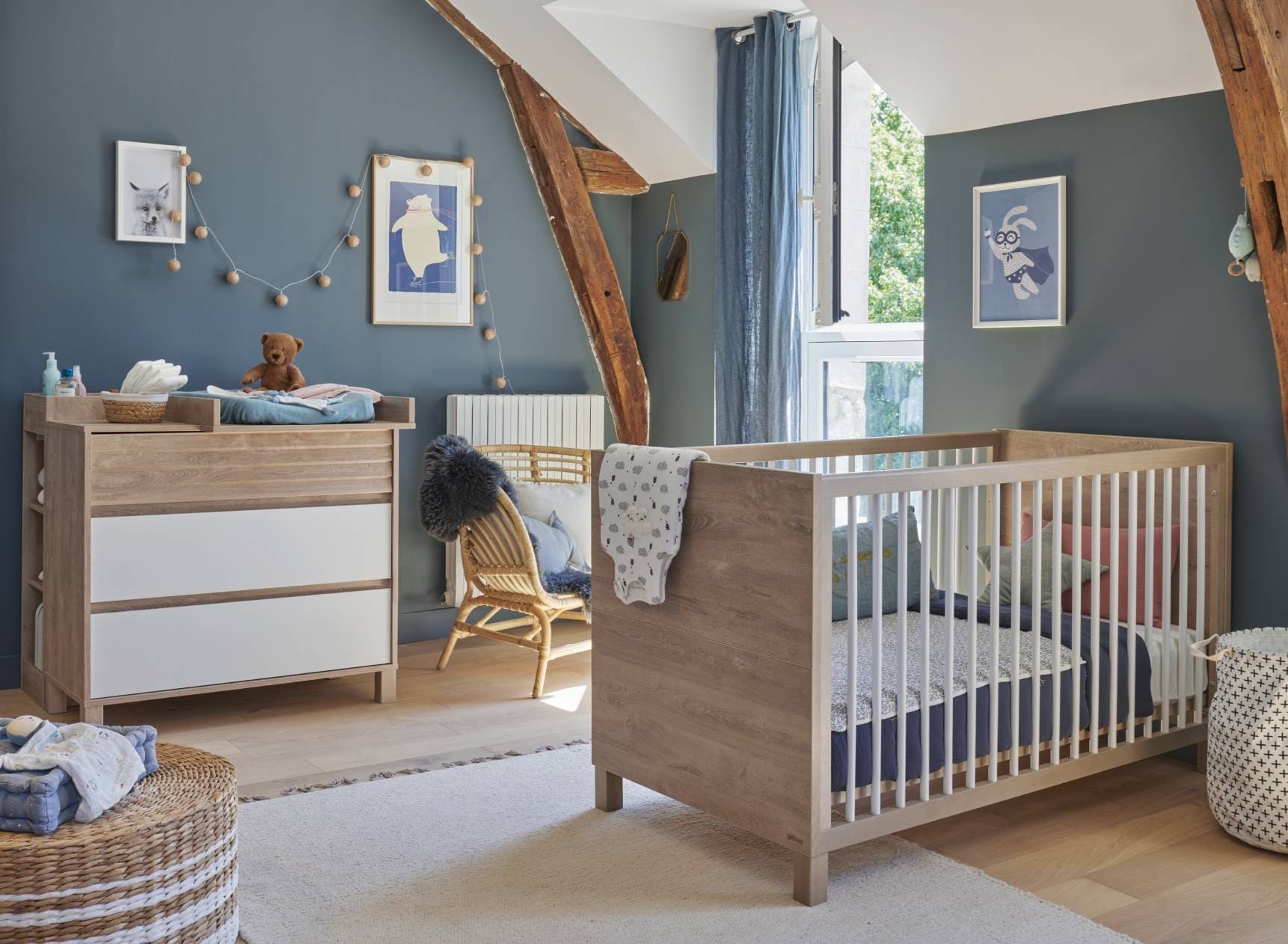
Did you know that the color of a nursery can directly influence a baby's emotion and well-being? Soft shades like blue are ideal for creating an atmosphere of calm and serenity in the interior space. Blue, often associated with relaxation, has even been scientifically proven to reduce heart rate and promote restorative sleep. It's a perfect choice for parents looking to create a soothing atmosphere.
However, not all shades of blue are equal. Opt for pastel tones or light grey-blue hues that diffuse soft, natural light in the space, rather than intense blues that might seem cold or distant. The quality of paint used is also crucial: choose eco-friendly paints without volatile organic compounds (VOCs) to ensure a healthy environment for your baby.
The relationship between colors and child's sleep
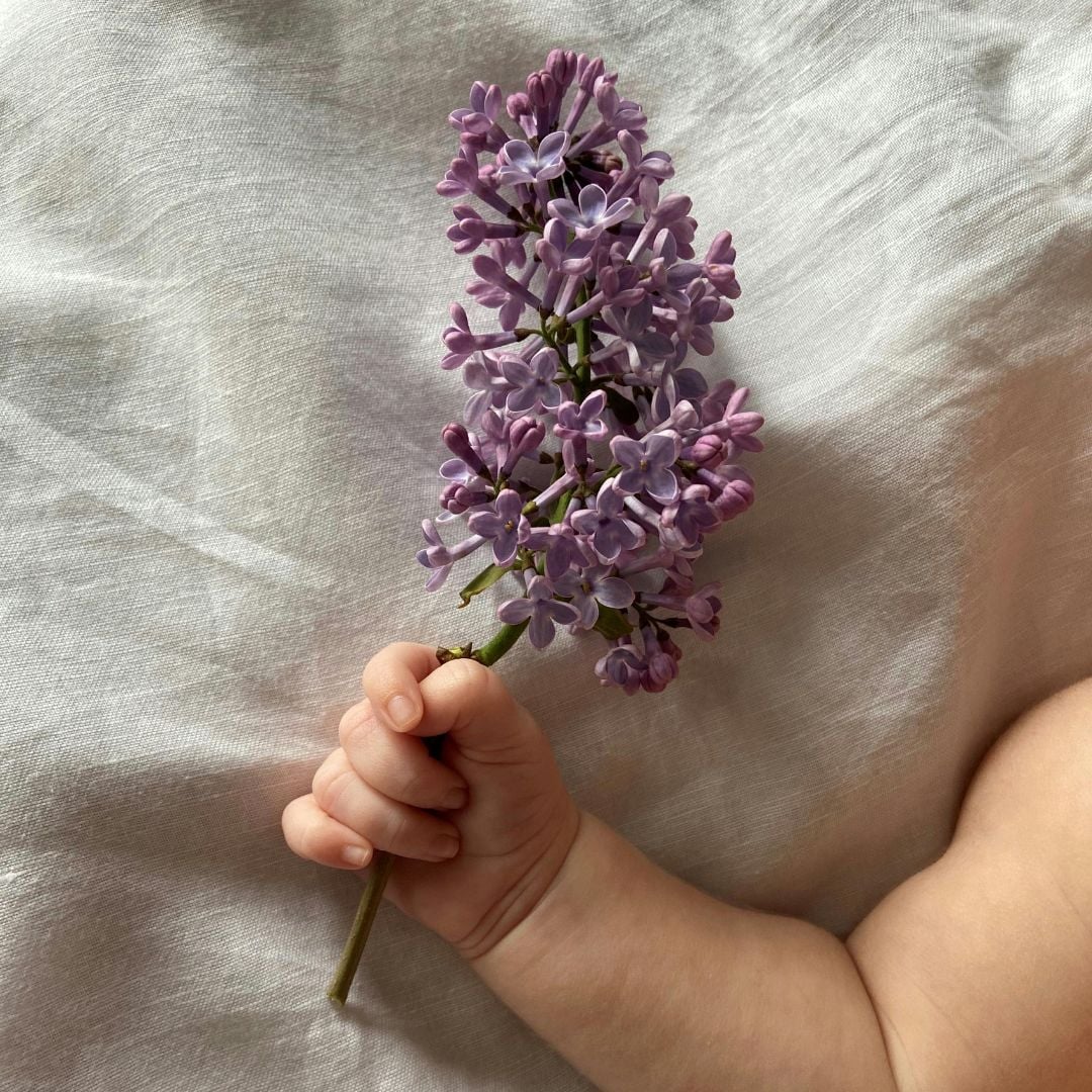
What if we told you that purple, often overlooked in nurseries, could be a valuable ally? This mysterious color, when chosen in lavender or lilac shades, inspires dreaming and encourages mental relaxation. An atmosphere subtly tinted with purple can help calm an agitated baby while stimulating a certain dreamlike creativity.
To maximize the relaxing effect of purple, consider incorporating it in small touches: a lavender-painted wall, a hanging mobile, or matching textiles. This balance between softness and depth will make the environment not only perfect for sleep but also visually harmonious.
Neutrality and softness
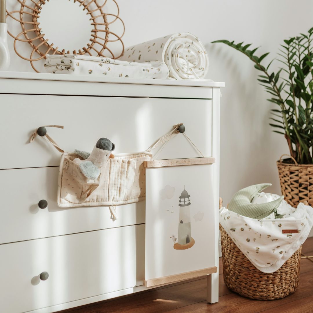
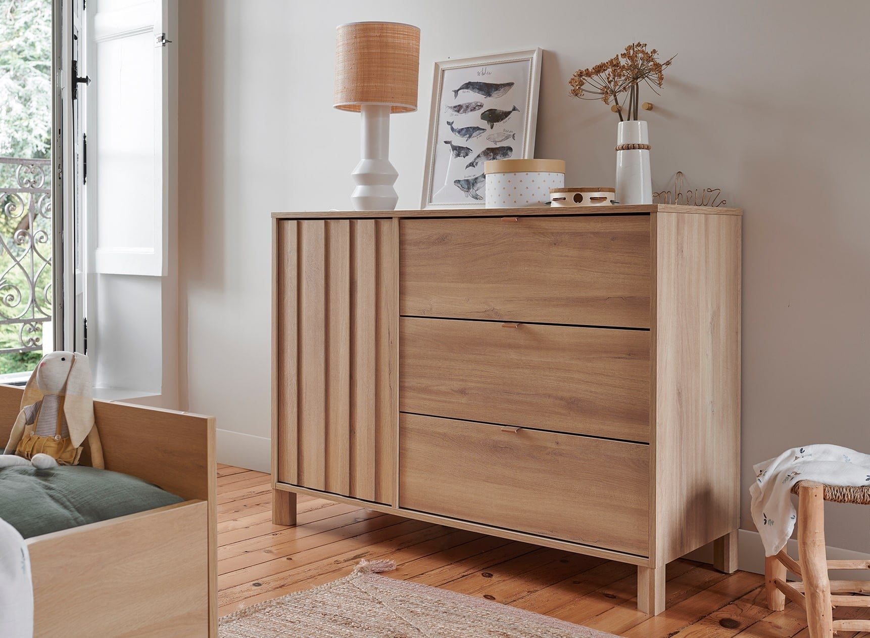
Neutral shades like light grey or off-white are true allies when it comes to creating a soft and welcoming atmosphere. Contrary to popular belief, these colors bring warmth and comfort, especially when paired with natural materials such as light wood or organic cotton textiles.
To prevent the room from appearing too cold or impersonal, play with textures: a soft pearl grey rug, light white curtains, and a few beige linen cushions will make all the difference. These subtle choices will wrap your baby in a cocoon of serenity.
Not sure which rug to choose for the nursery? Check out our dedicated blog article.
Stimulating development and creativity: Color palette for activity
Stimulating shades
Children need an environment that stimulates their sensory development. Bright colors like orange, often associated with creativity, infuse positive energy into the room while encouraging enthusiasm and curiosity. But be careful not to overdo it! A touch of orange on an accent wall or accessories is more than enough to achieve this effect without overwhelming the space.
The secret lies in balanced use: combine this dynamic shade with softer colors like sandy beige or light olive green to maintain visual harmony. This way, you'll create a space conducive to both concentration and joy.
Harmonizing with toys and accessories
It's wise to adopt a palette that naturally integrates with toys, which are often very colorful. Green, synonymous with balance and nature, is ideal for this function thanks to its unique ability to harmonize with almost all other shades present in the space.
For example, a sage green wall can serve as a neutral backdrop while adding a fresh and modern touch to the overall decor. Combine this with furniture in natural wood or painted in trendy shades like off-white for a timeless yet always warm result.
The clever use of color accents
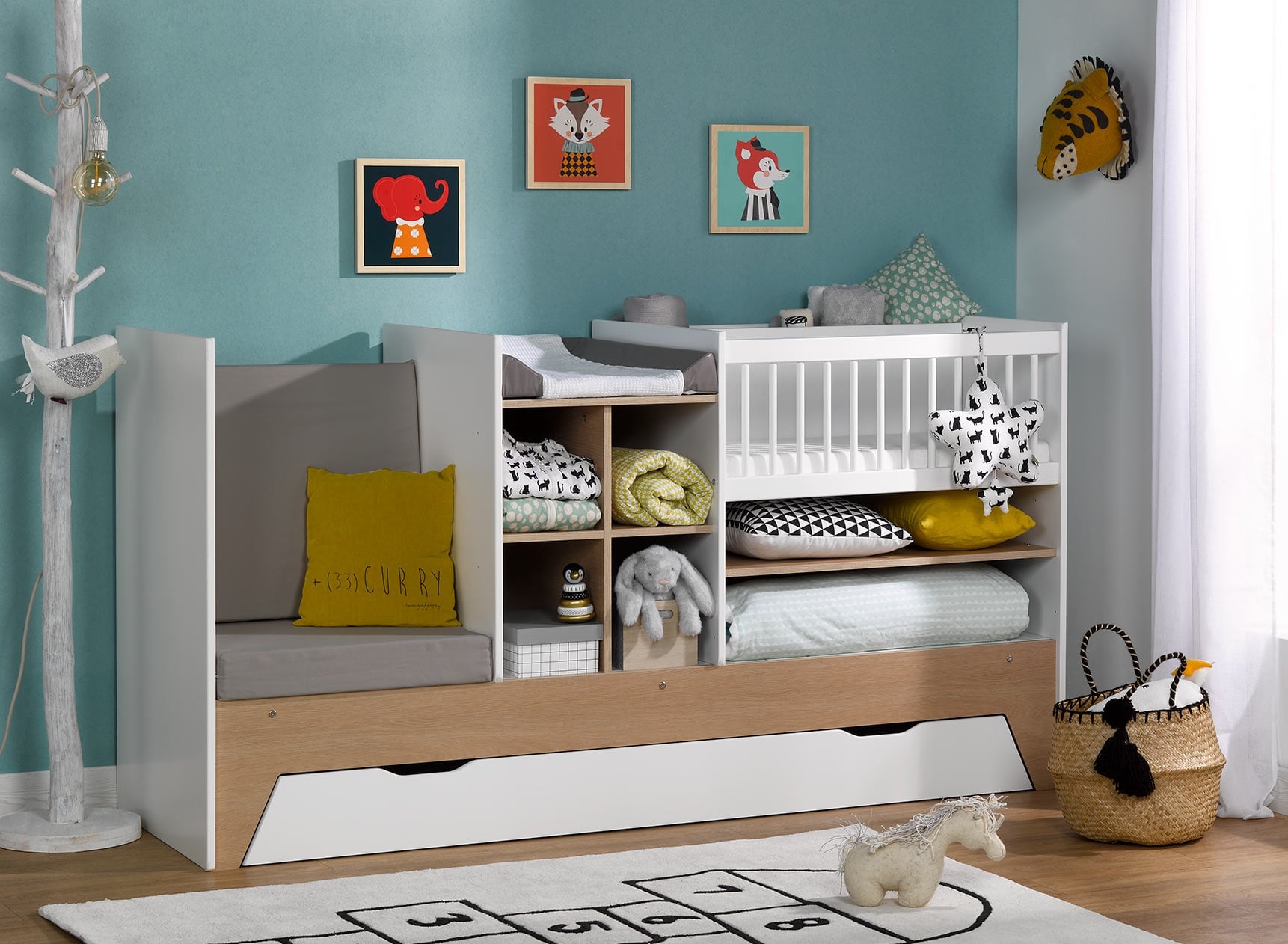
Afraid a monochrome room might be too monotonous? Color accents are here to save your decoration! Yellow, for example, brings a subtle dose of energy and encourages shared moments of happiness. However, it should be used sparingly - a mustard yellow cushion here, a lamp there is plenty.
The ultimate trick is to create gentle combinations that don't tire the eyes: pair pale yellow with light grey or creamy white to maintain overall harmony while introducing that necessary little "pop".
Balancing trends and timelessness: Choosing sustainably
The importance of timeless colors
Savvy parents know that a room evolves quickly over the years... Why not opt for timeless shades like off-white, the ultimate symbol of purity and simplicity? This choice not only maintains a peaceful atmosphere but also provides a neutral base compatible with all kinds of future changes, from rearrangement to complete theme changes!
To enhance this sense of peace, use matte finishes on your walls. These non-reflective surfaces accentuate visual softness while better hiding any marks left by curious little hands.
Current trends and their impact
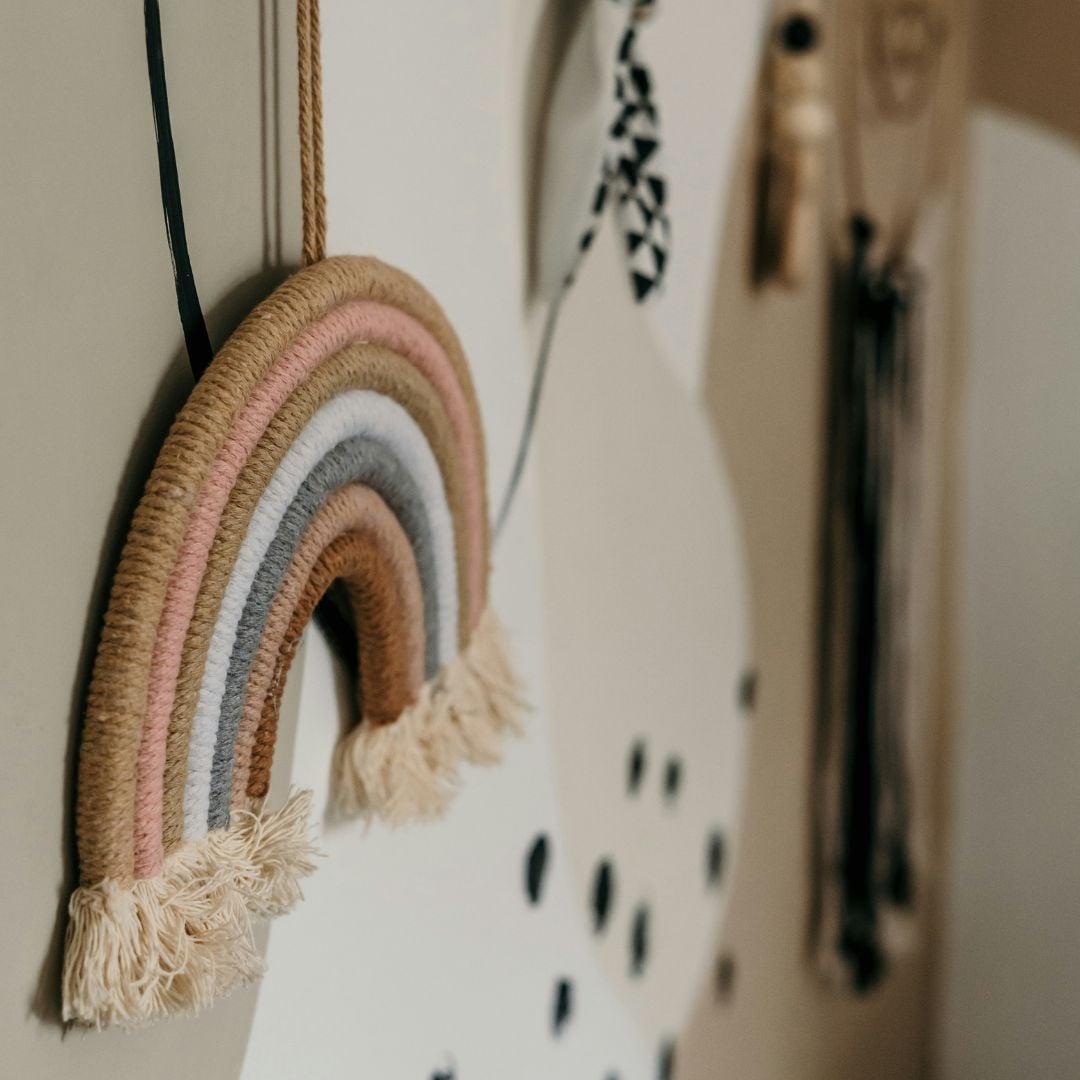
The comeback of powder pink perfectly illustrates how to combine modernity with tradition. Far from the garish bubblegum pink of the past, this subtle shade is now favored by interior designers for its warm yet discreet character.
Pair it with taupe grey or even sage green to create an elegant contrast that stays true to current trends without sacrificing the desired timelessness.
Combining colors and furniture: Creating visual harmony
Coordination with the bed and furniture
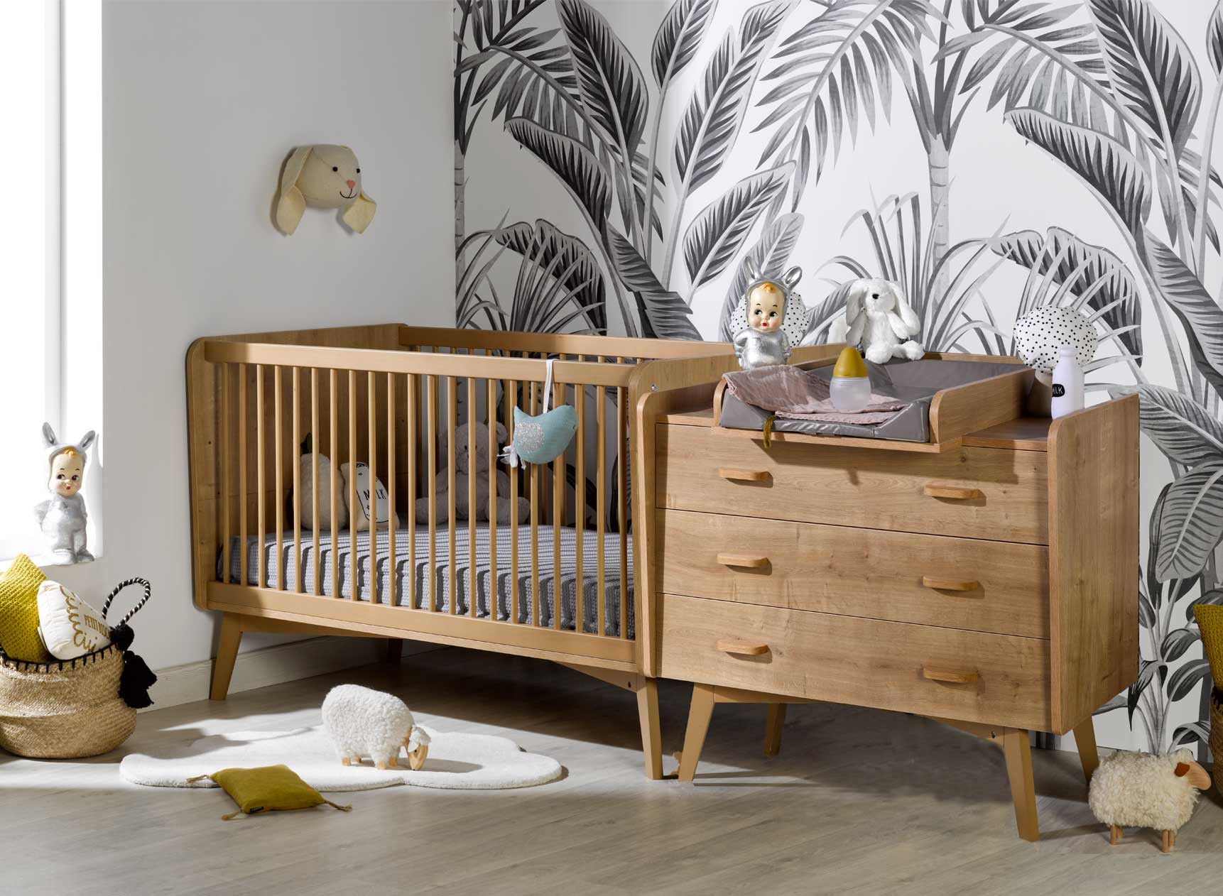
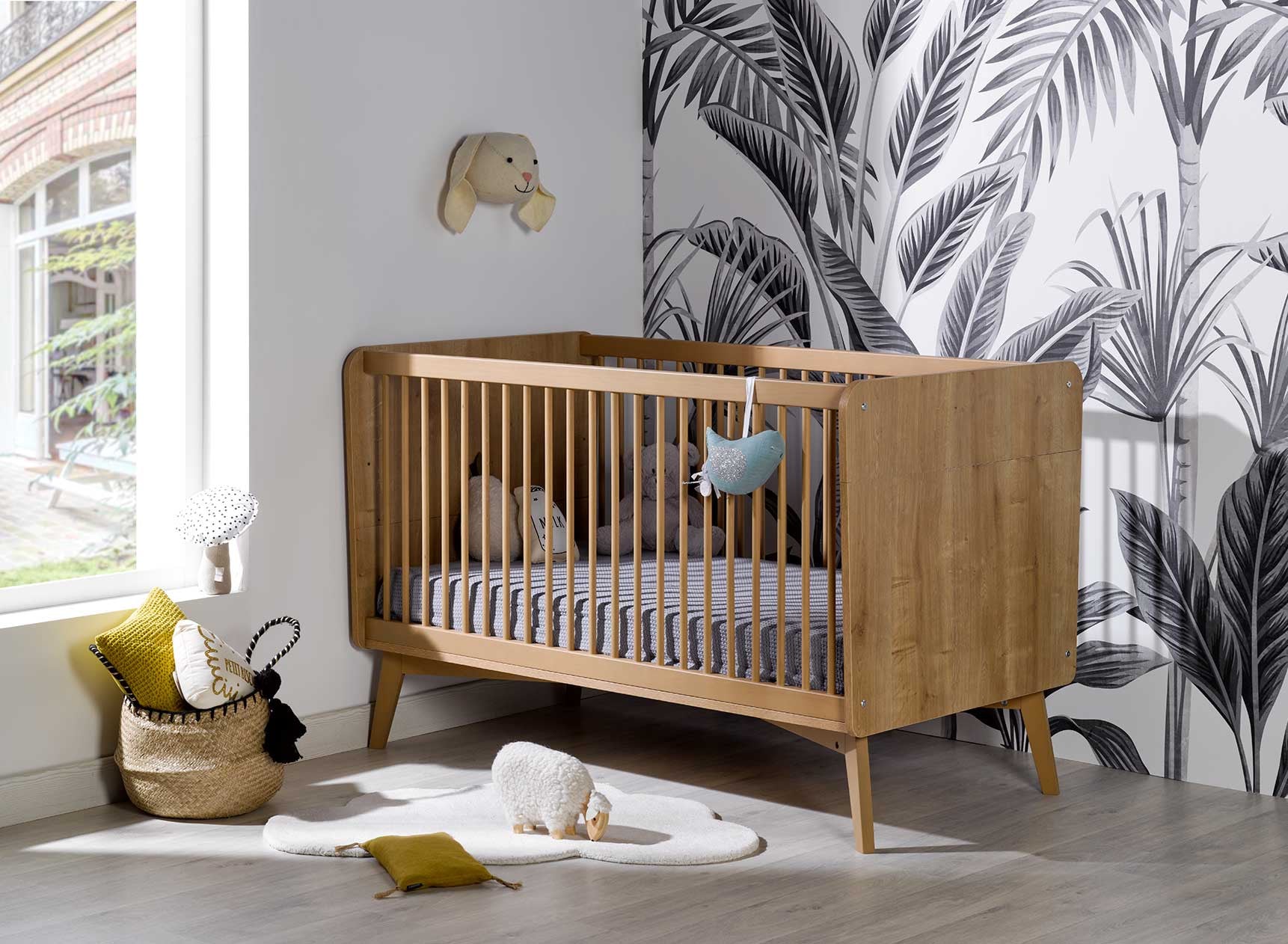
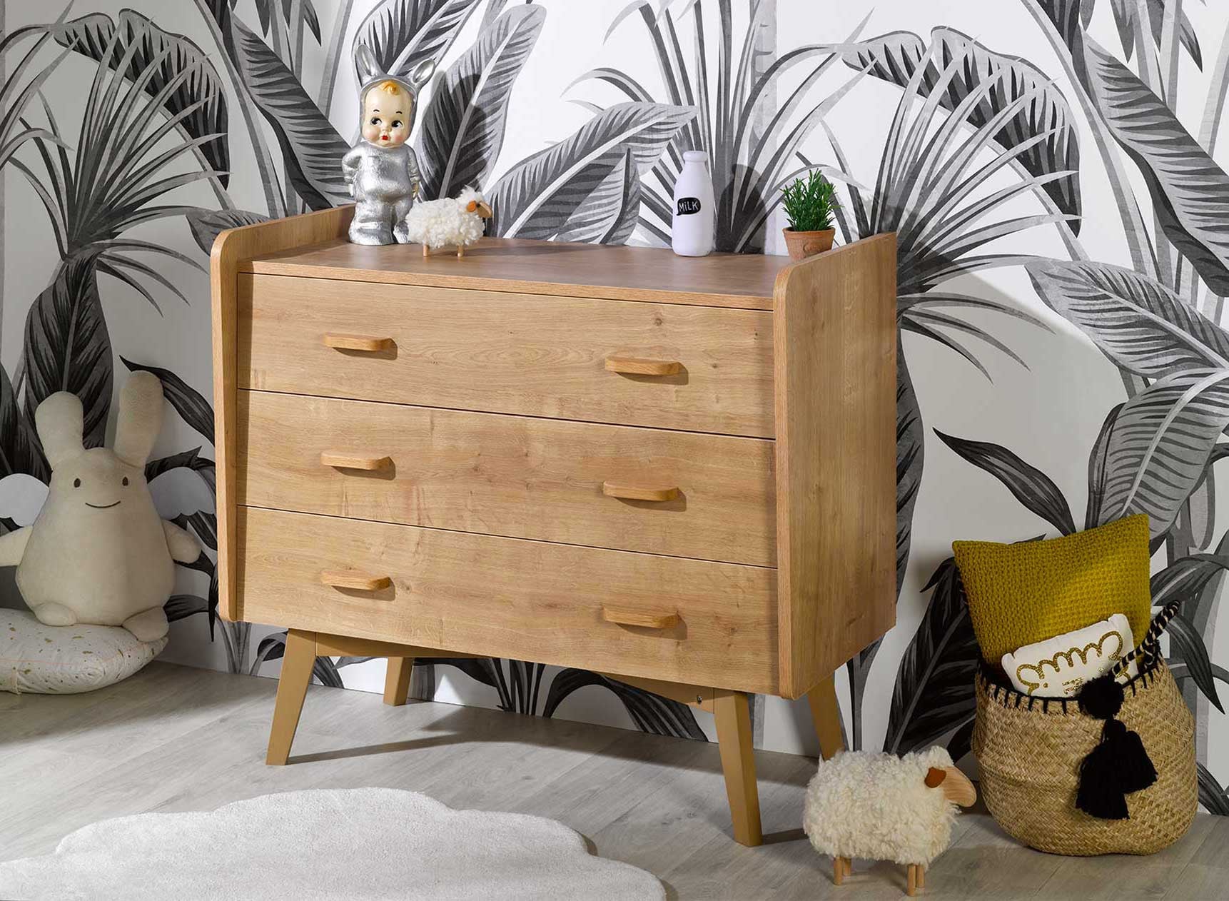
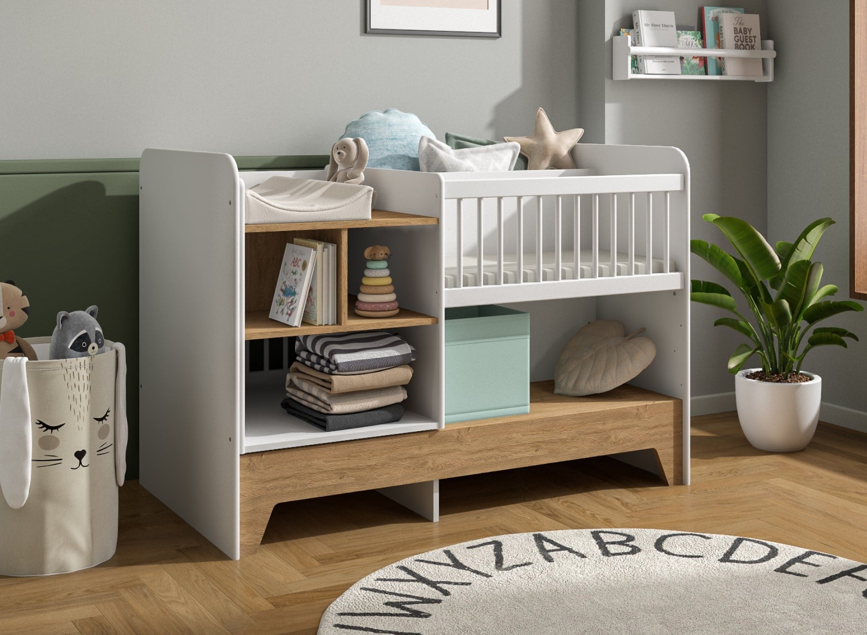
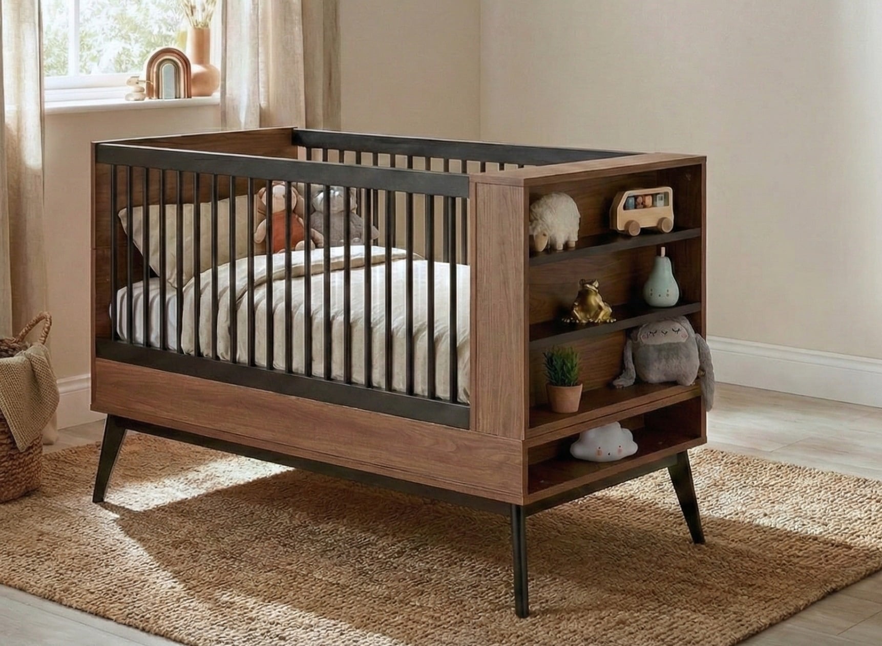
One of the central elements in any room remains obviously the bed! For it to integrate perfectly with the overall design without visually dominating the available space, choose it in natural materials (raw or painted wood). Then combine its clean lines with some accessories in light tones; this will instantly generate a soothing sensation where every detail seems custom-designed.
For example, opt for our eco-responsible baby beds.
Sage green and wood bedroom: how to create a natural and soothing space
Children's bed size: the complete guide for healthy and safe sleep
How to decorate your bedroom with healthy materials?