How to choose the ideal color for a harmonious bedroom?
-
Categories :
Inspiration


Baby's room
Baby Bedding
Baby accessories
Baby bestsellers
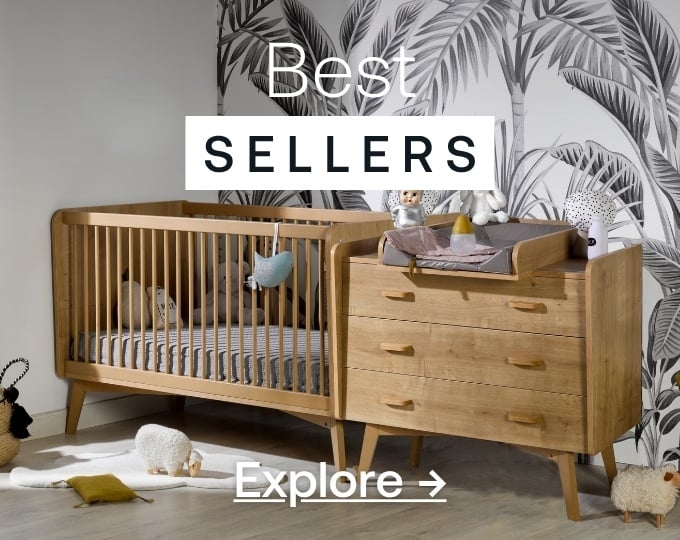
bestsellers

Children's bedroom
Children's bed accessories
Children's bedding
Children's Decor
best sellers

best selling

Bedroom
Headboard
Office furniture
Bedding
bestsellers

bestsellers

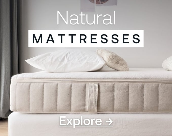
mattress

x

x

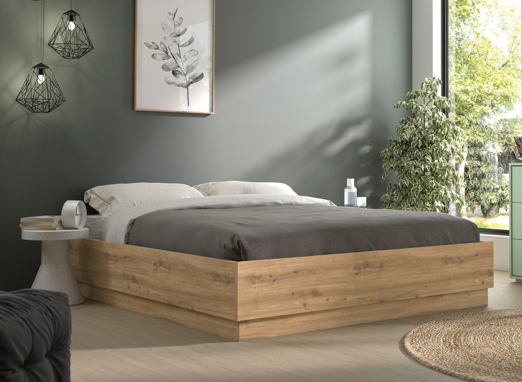
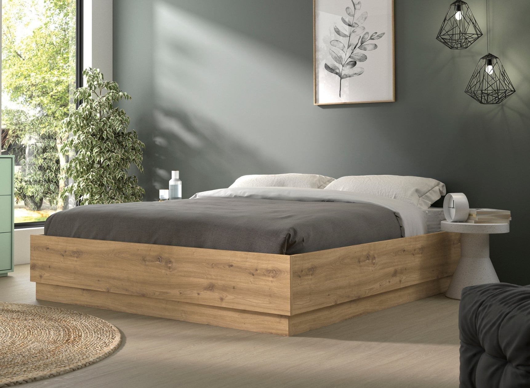
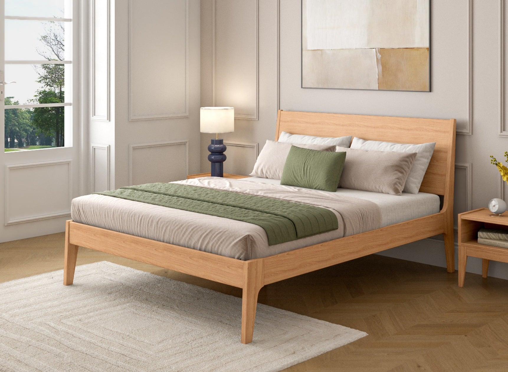
 Sage green and wood bedroom: how to create a natural and soothing space
 Children's bed size: the complete guide for healthy and safe sleep
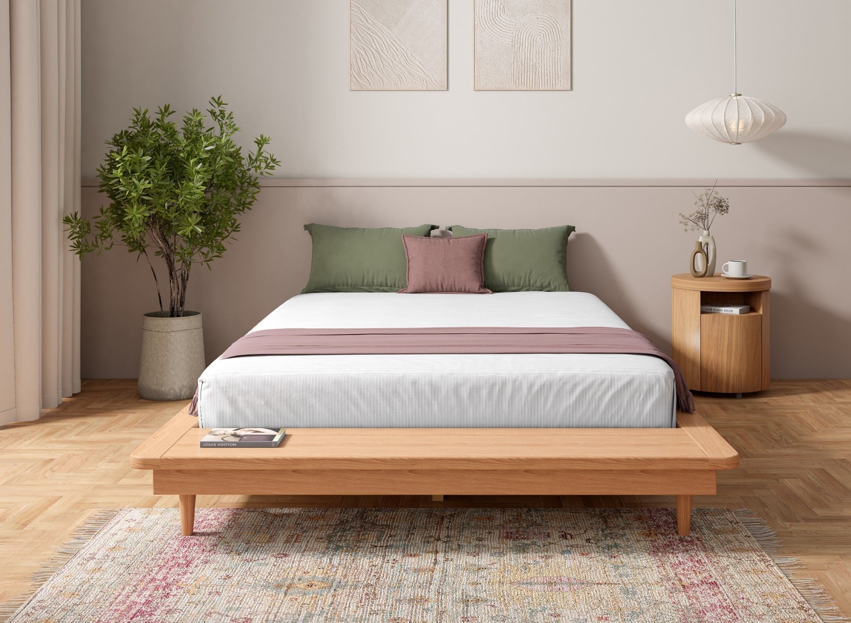
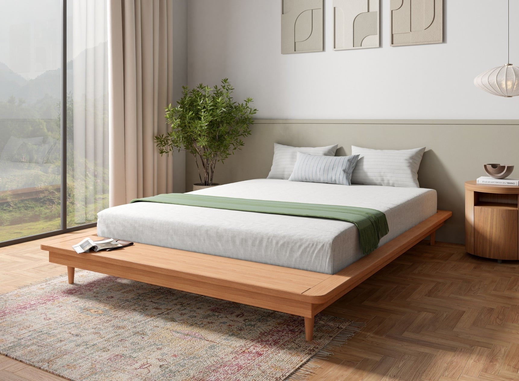
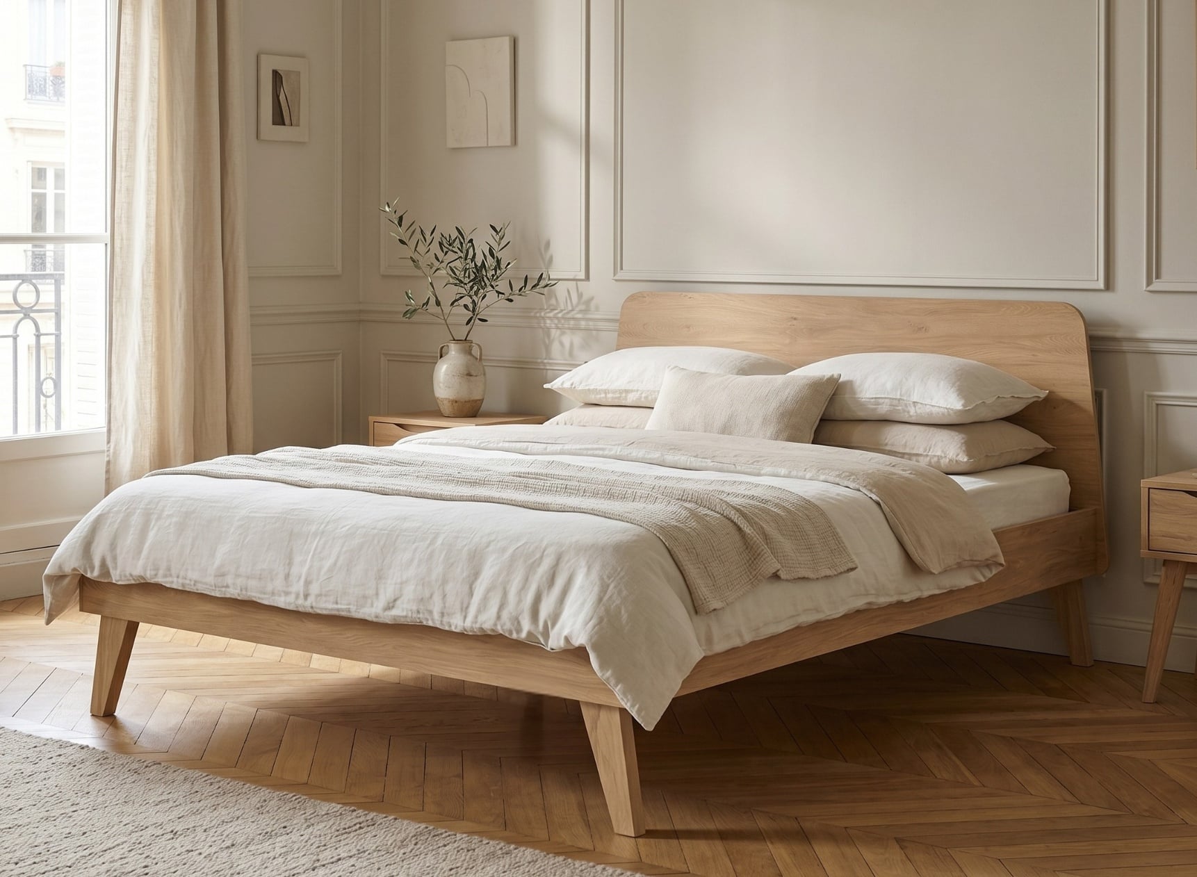
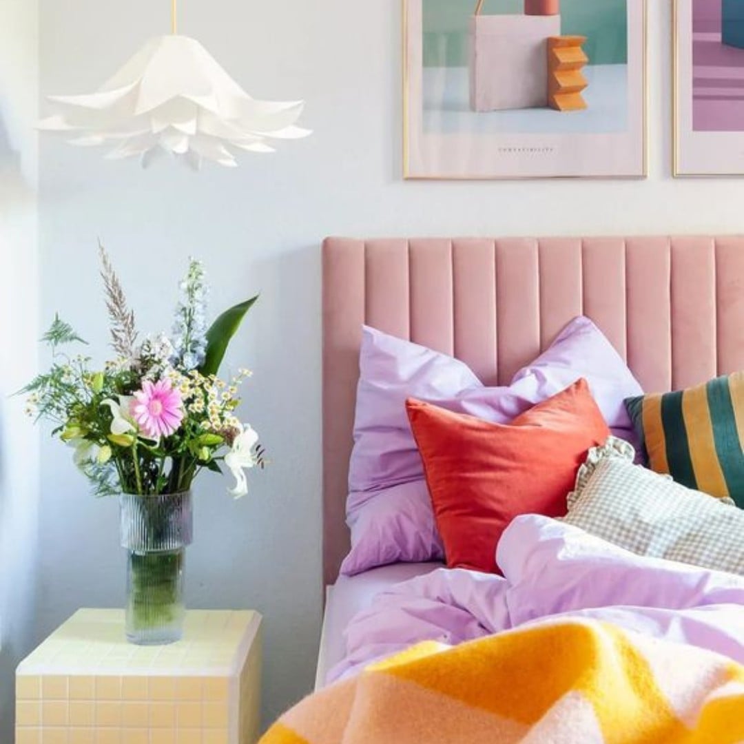
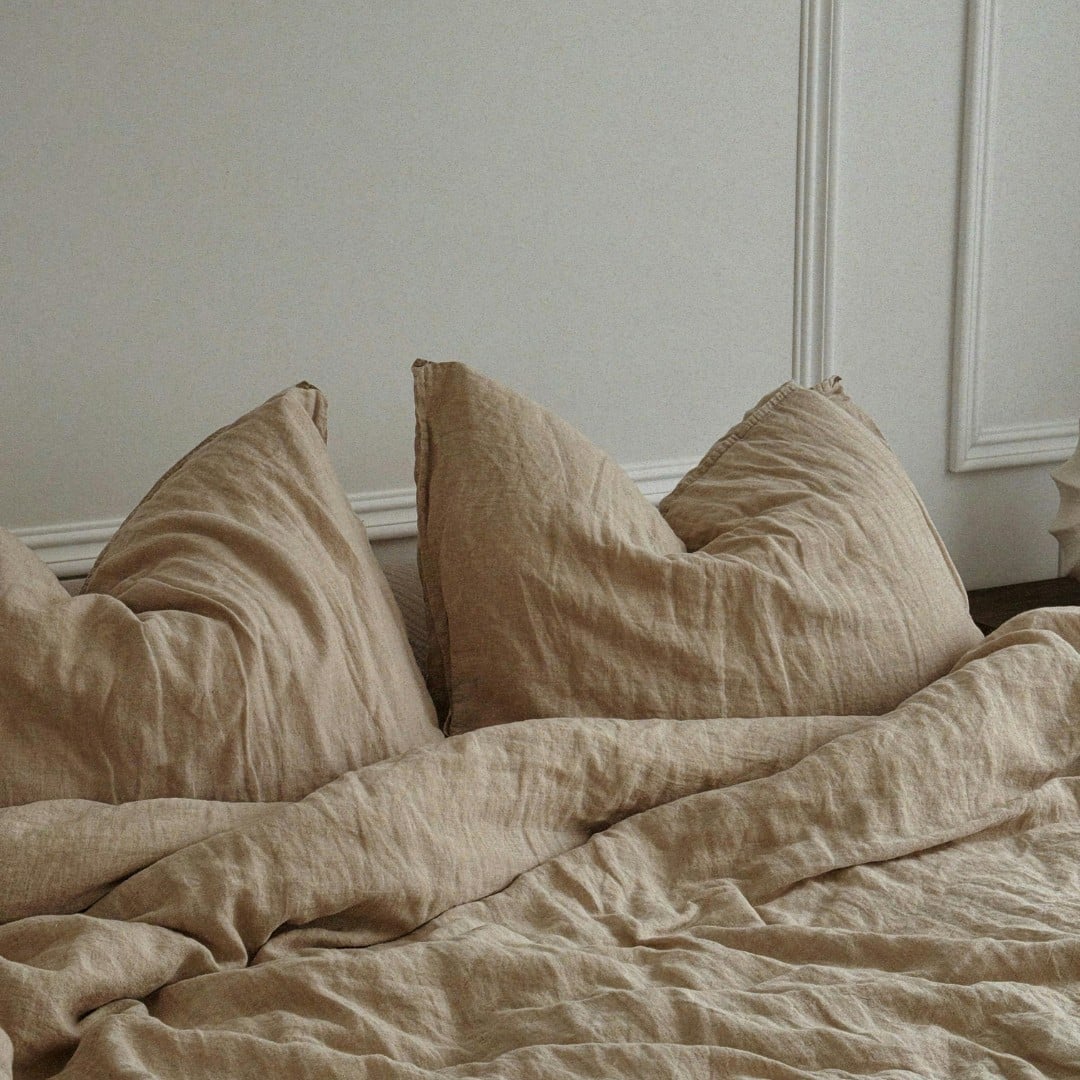
 How to decorate your bedroom with healthy materials?